Create UI process
- 2020.12.10
- Develop Diary

UI (User Interface) and UX (User Experience) are two things that you will inevitably run into when developing software. UI refers to the buttons and screen structure of the software. In this article, we will discuss the changes in UI during the development stage.
Unity, Adobe products, and CG software have so many features that it is often difficult to know which window or button to press. These software programs take time to learn, but once you get used to them, you will be able to handle all kinds of situations. There are so many functions that you will learn which ones you use and which ones you don’t….
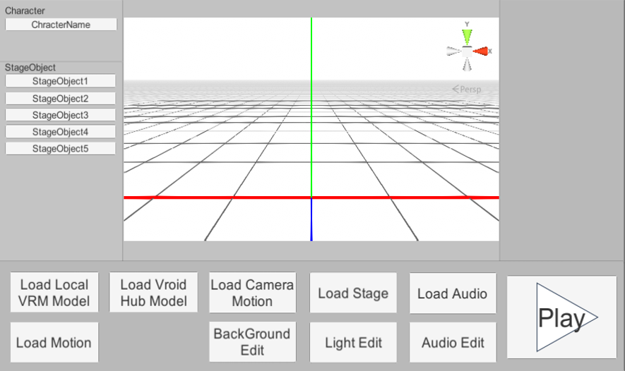
In creating the UI, I was conscious of the fact that it can be played in three steps without any knowledge like CG software. I believe that the first impression from starting the software to playback is very important, so I wanted to create a design that anyone can understand the steps to playback.
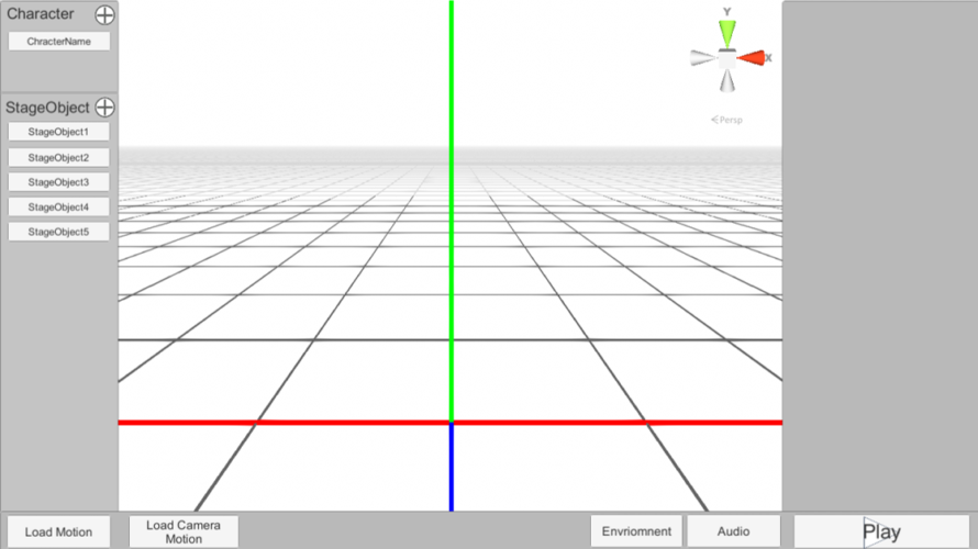
I tried to make it as simple as possible so that anyone could understand it, and the initial UI looked like this, with Unity’s screen structure in mind.

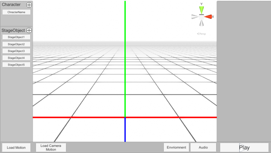
This is what it looked like after I modified it. I got a lot of feedback from friends and made a lot of changes. I really appreciate it. One point that was pointed out to me was that the editing screen is too small and the surrounding screens are too big. I was also asked to change the frame display. I also added a request for frame display at that time. Now that I’ve fixed some of the bugs, I think it’s time to have someone take a look at it. I’m still worried about the blank space at the bottom. I was thinking of adding a screen filter function or something. I’m hoping to add that soon. So I decided to make it simpler, and here it is.

Made the surrounding windows smaller and the editing window larger. It’s cleaner now. You can see what’s going on even if the buttons are small. It’s almost the default design of Unity, so I’d like to change it to a different design. I’d also like to make the colors more unique and consistent. I’d like to make the UI design look good, stress-free, and exciting to use for the software.
It makes sense that games and software have UI/UX designers. Even if the function is good, if it’s hard to use, the original value will be diminished.
This is a summary of what I fixed in making the screen. In the future, I’d like to work on the colors and button design. Currently, it’s not too cluttered because it doesn’t have many functions, but I’d like to make it easier to see and use when I add more functions. If I start making timelines and such, I may end up with a screen structure similar to Premiere Pro.
-
前の記事

InputField and Slider Synchronization 2020.12.09
-
次の記事
記事がありません